

Doccé
CPG | DTC & RETAIL | LAUNCH
SCOPE
Brand Strategy
Voice & Messaging
Visual Identity System
Packaging Design
Website Design
Social Media Guides
Sales Materials & Templates
MY ROLE
Collaborated on brand strategy & positioning. Led & executed identity development, brand eco-system, messaging, illustration, packaging, website design, and launch-ready brand systems.
MODERN
|
BOLD
|
PLAYFUL
|
MODERN | BOLD | PLAYFUL |
THE OPPORTUNITY
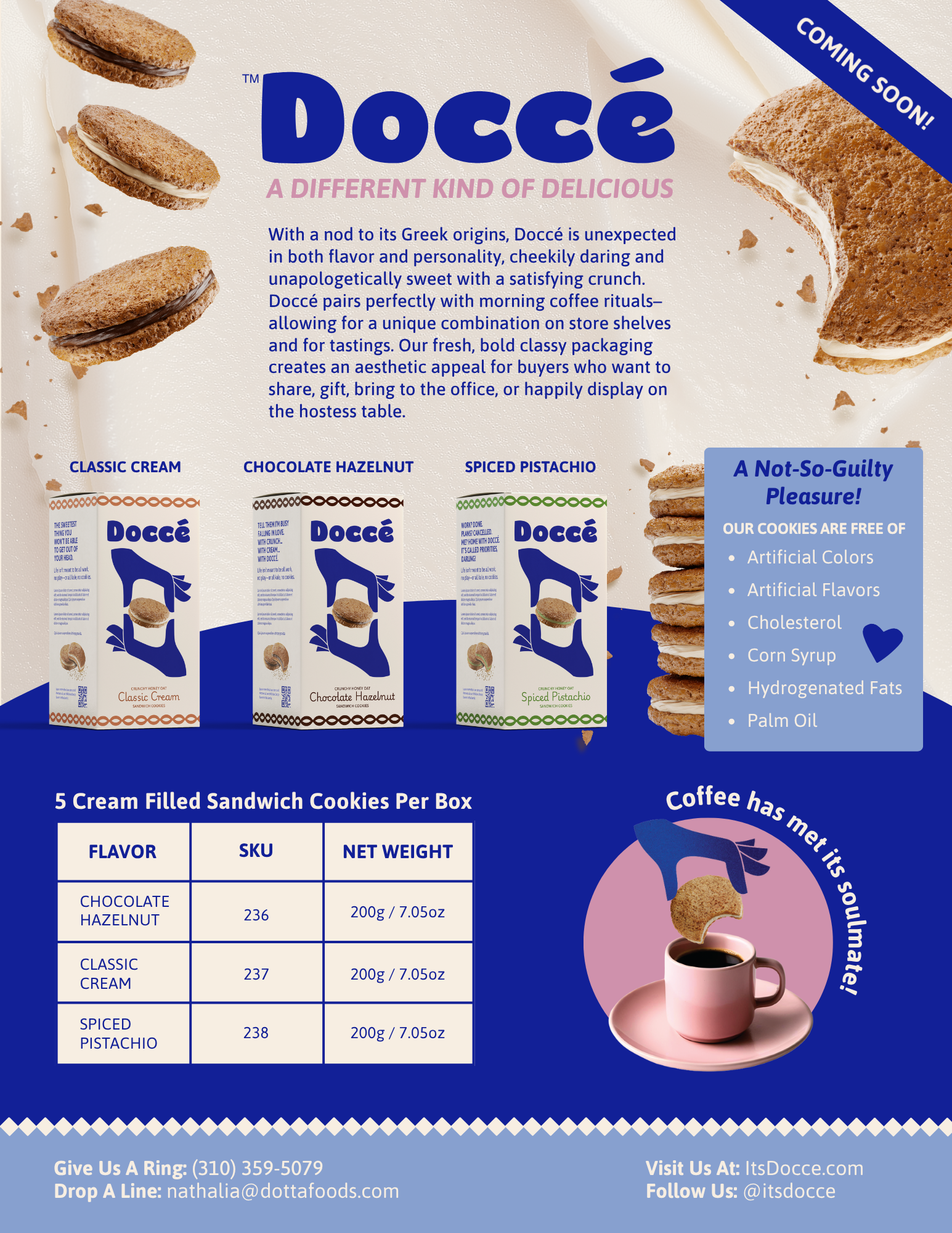
When the founders of Doccé approached us, they had a unique product, deep experience in consumer packaged goods, and valuable retail relationships—but no brand.
Their goal was to introduce a premium Greek cookie to the American market and earn placement with specialty retailers and national chains. To do that, they needed more than attractive packaging. They needed a story, a personality, and a clear position within a crowded category.
The challenge was surprisingly philosophical.
We live in a culture obsessed with optimization. Every meal is scrutinized. Every indulgence is negotiated. Every pleasure seems to come with a disclaimer.
So where does a decadent cookie fit into modern life?
Rather than competing with wellness culture, we chose to challenge the assumption that every choice needs to be justified. We built a brand around a simple belief:
Joy deserves a place at the table.
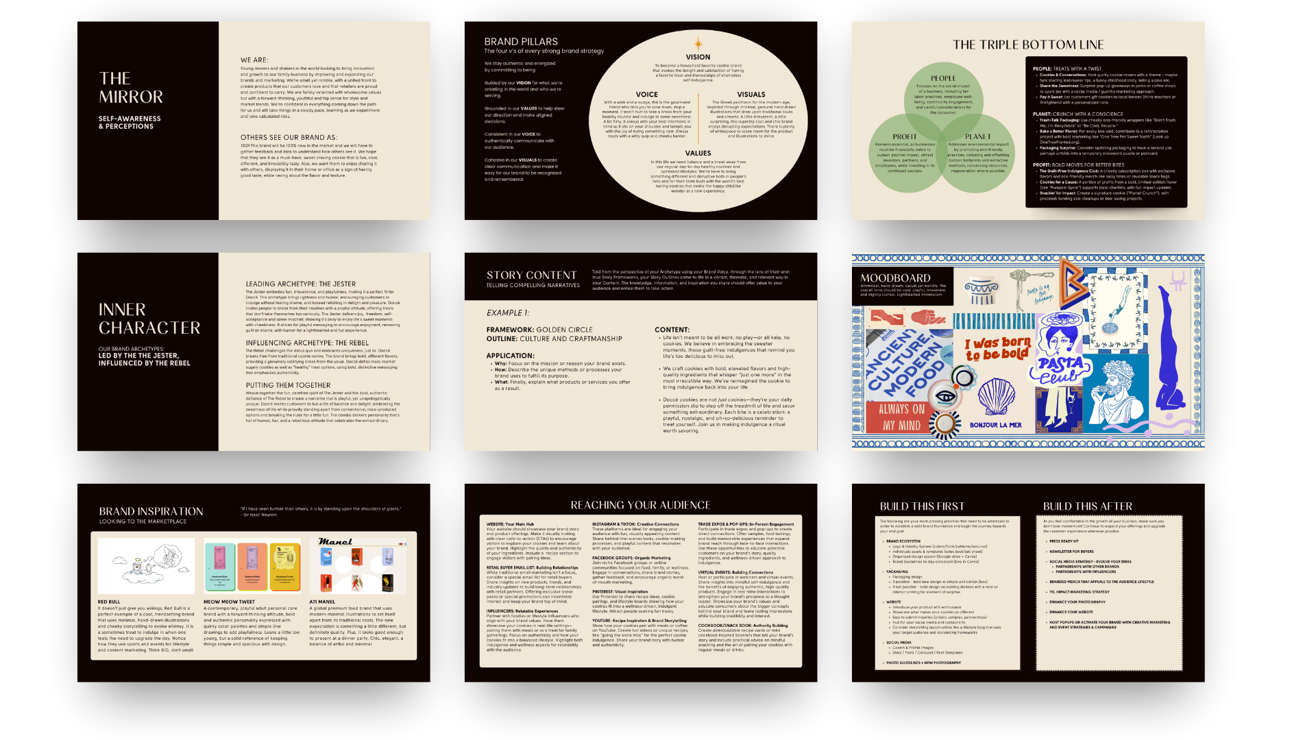
A STRATEGIC FOUNDATION
We began with a Deus Marca North Star Brand Map, a 50+ page strategy document that established the foundation for the business and defined the brand's values, audience, positioning, personality, and long-term goals.
Together, we explored the tension at the heart of the product: indulgence and balance.
What emerged wasn't simply a cookie brand.
The result was a brand strategy centered around generosity, connection, celebration, and the idea that life's sweetest moments are often the ones we share. Most importantly, Doccé became an invitation to stop treating pleasure like a reward and start treating it like part of a life well-lived.
Every decision that followed—from visual identity to packaging copy—was designed to support that core belief.
CONCEPT DEVELOPMENT
Using the strategic foundation as a guide, I developed three early creative territories—each testing a different emotional and strategic direction for the brand.
Exploratory rather than fully realized identities, these concept routes allowed us to evaluate how different stories, visual languages, and customer motivations might shape the future of Doccé.
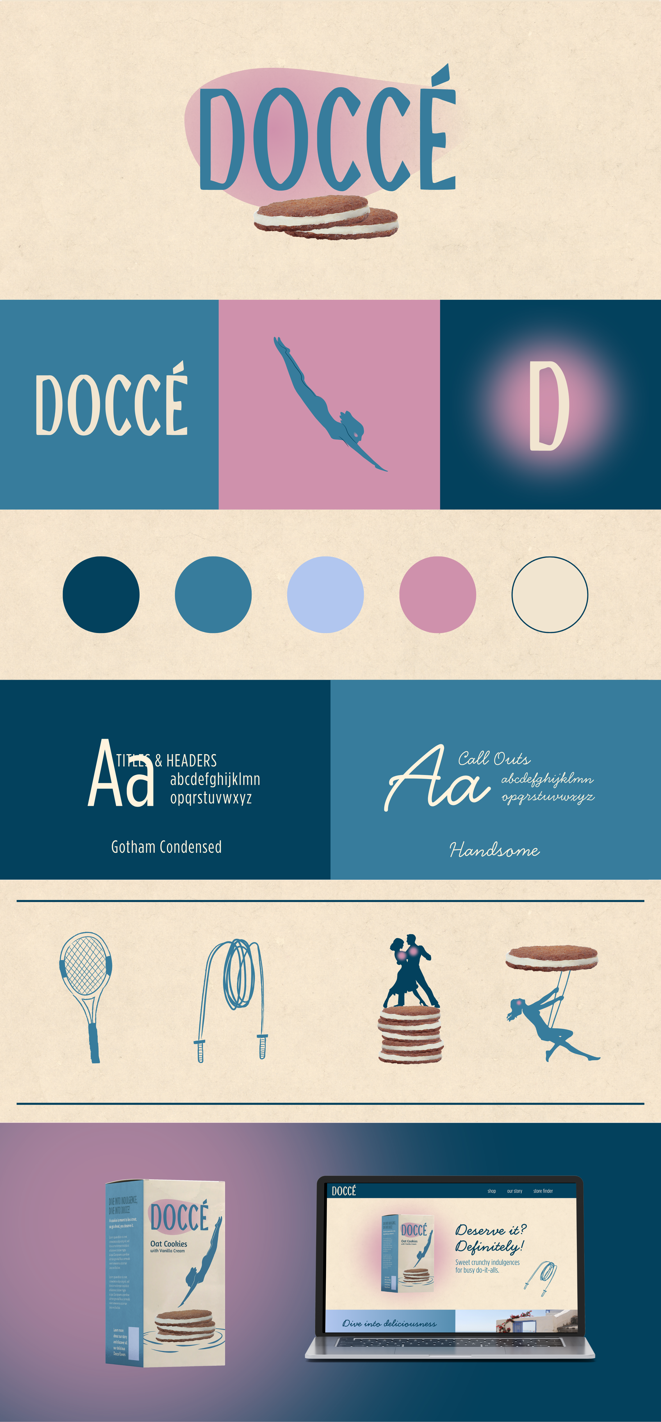
ROUTE 01: PERMISSION TO INDULGE
This direction targeted active, health-conscious consumers, mostly women, who occasionally give themselves permission to indulge. The visual language centered around movement, playfulness, and the idea that enjoying a treat should never come with guilt.
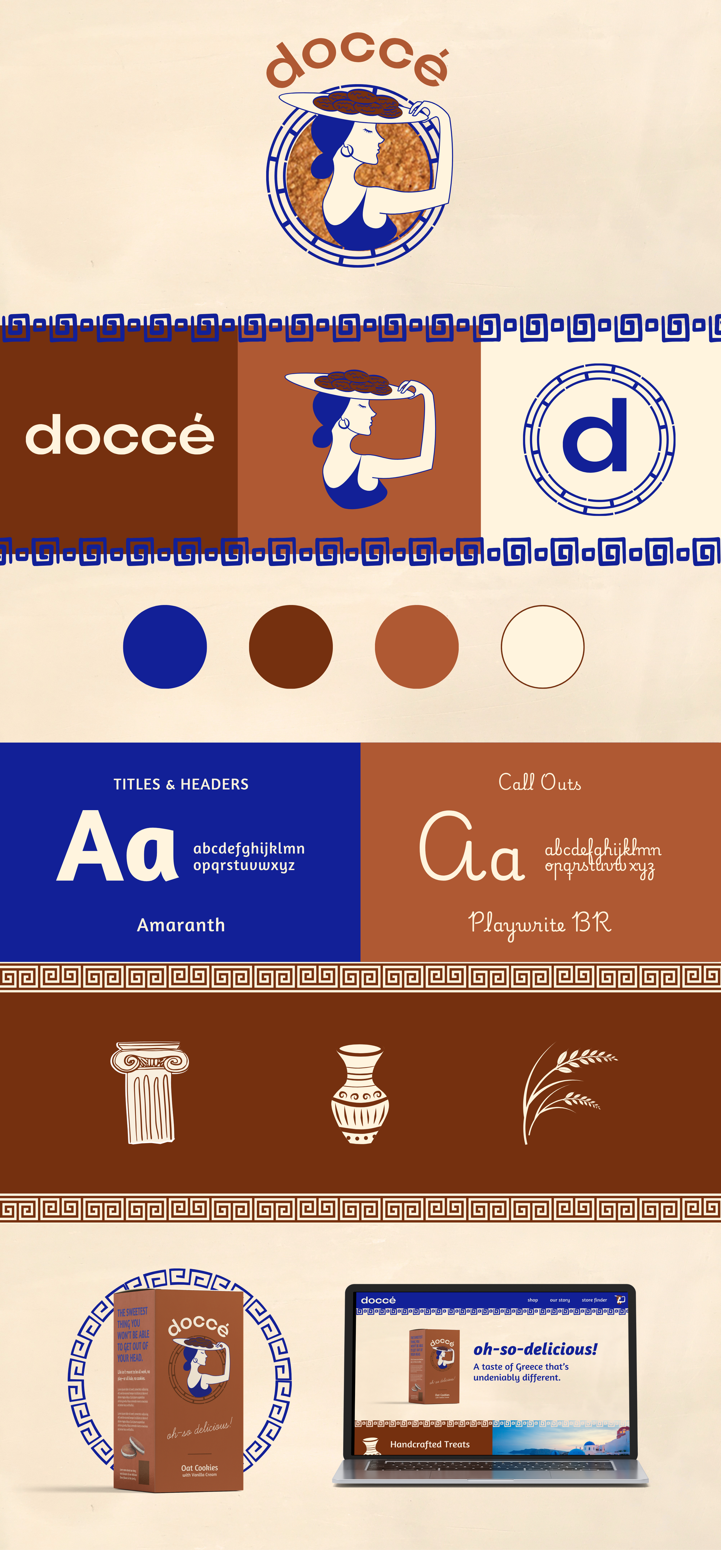
ROUTE 02: THE ART OF BALANCE
Inspired by hospitality, elegance, and Greek heritage, this concept explored the balance between wellness and pleasure. The visual system featured graceful illustrations and subtle Mediterranean influences, while the messaging began introducing themes of hosting, generosity, and celebration.
ROUTE 03: HOSPITALITY MADE TANGIBLE
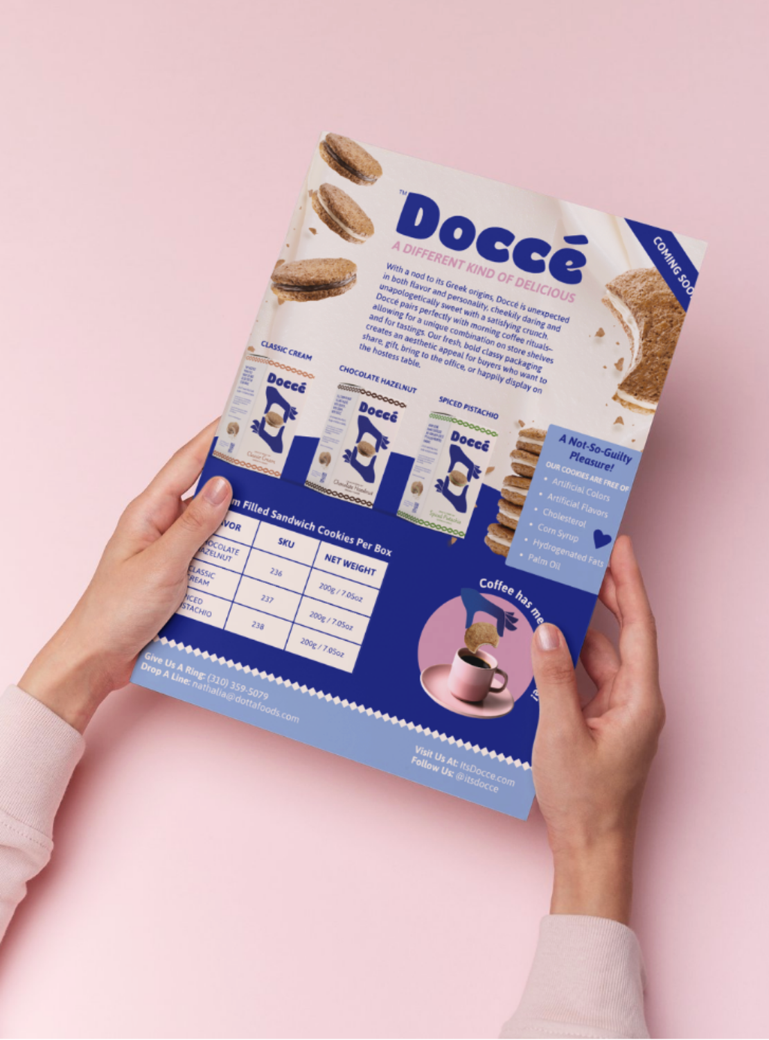
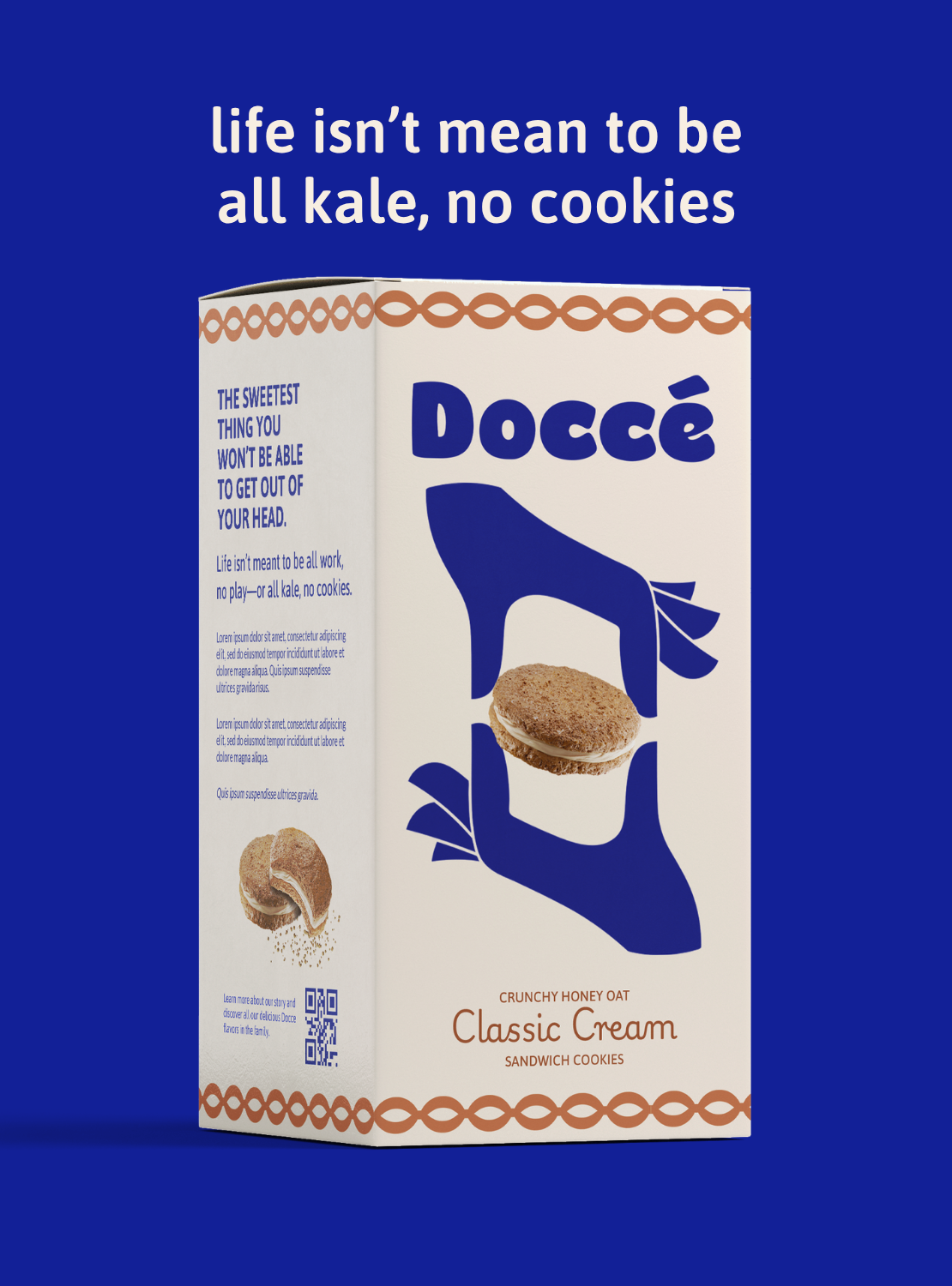
This direction focused on the handmade nature of the product and the act of giving. Bold illustrated hands became a visual symbol for craftsmanship, hospitality, connection, and generosity—creating a flexible system capable of expanding across packaging, digital experiences, and future brand touchpoints.
CLIENT RECEPTION
While Route 02 helped establish the emotional tone and personality that would eventually shape the brand voice, the visuals of Route 03 provided a stronger platform for long-term storytelling and shelf presence. The client also requested that the blush tones of Route 1 be incorporated into an overall bolder color palette. Its distinctive visual language helped the founders immediately envision the future of the brand.
Their reaction was simple:
"This branding feels right. We are confident going out into the world and selling this product."
BRINGING THE BRAND TO LIFE
The final identity extended into a comprehensive brand ecosystem designed to support both consumer engagement and retail growth.
Key deliverables included:
Logo and identity system
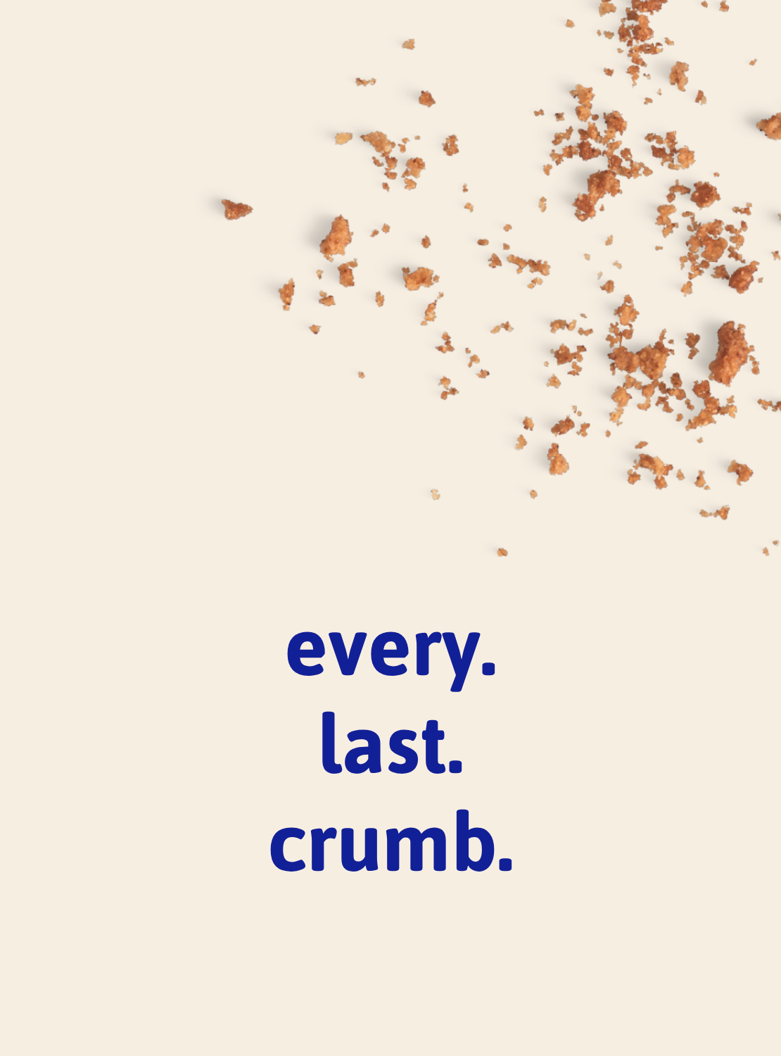
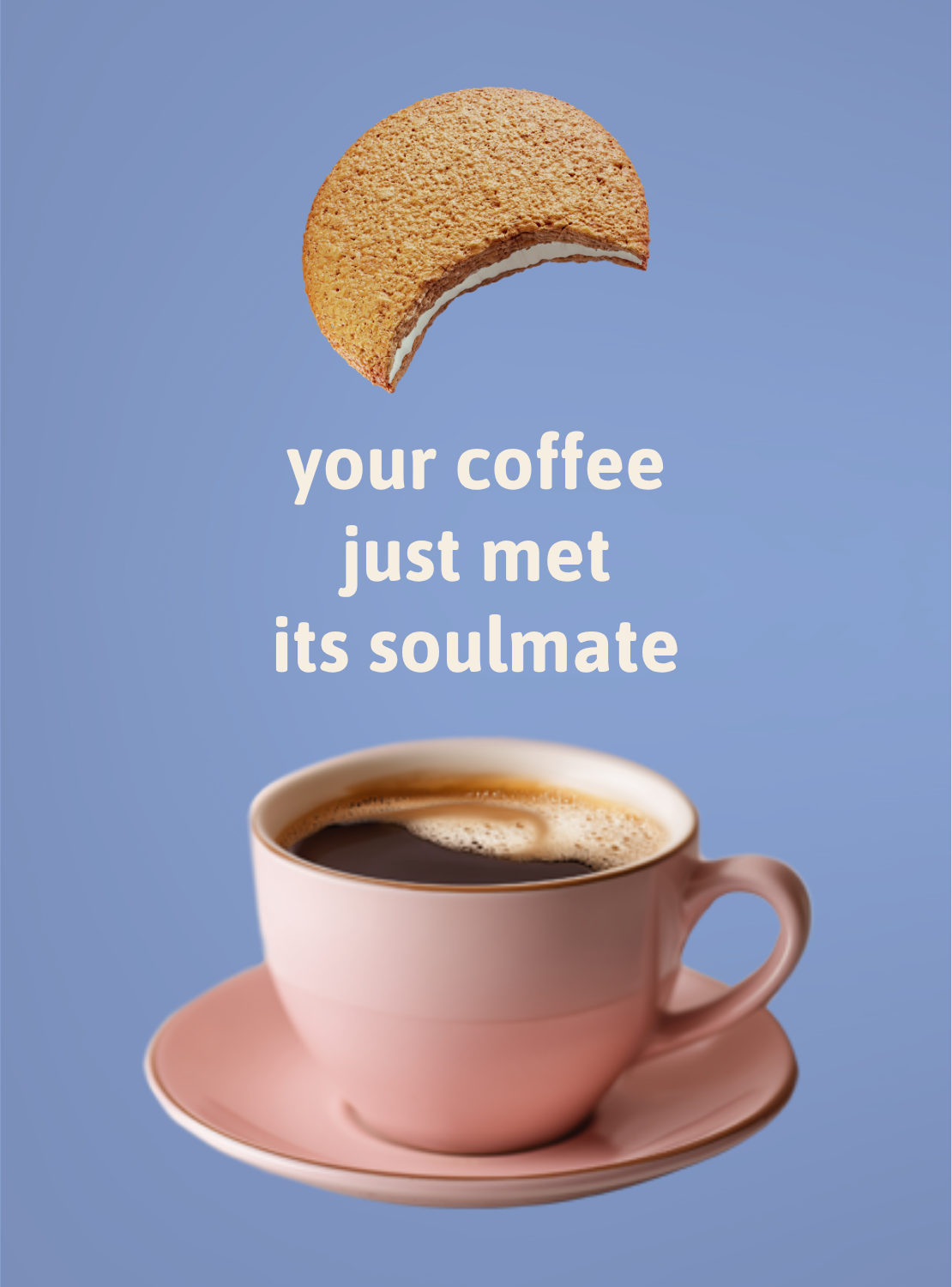
Custom illustrations
Packaging design system
Shopify website design
Social media templates
Sales materials
Brand guidelines
Messaging library
Each touchpoint was designed to help the founders sell the product, tell the story, and build confidence with retail buyers, specialty stores, and future customers.
Together, these pieces turned a product concept into a brand world: playful, modern, bold, and ready to be shared.
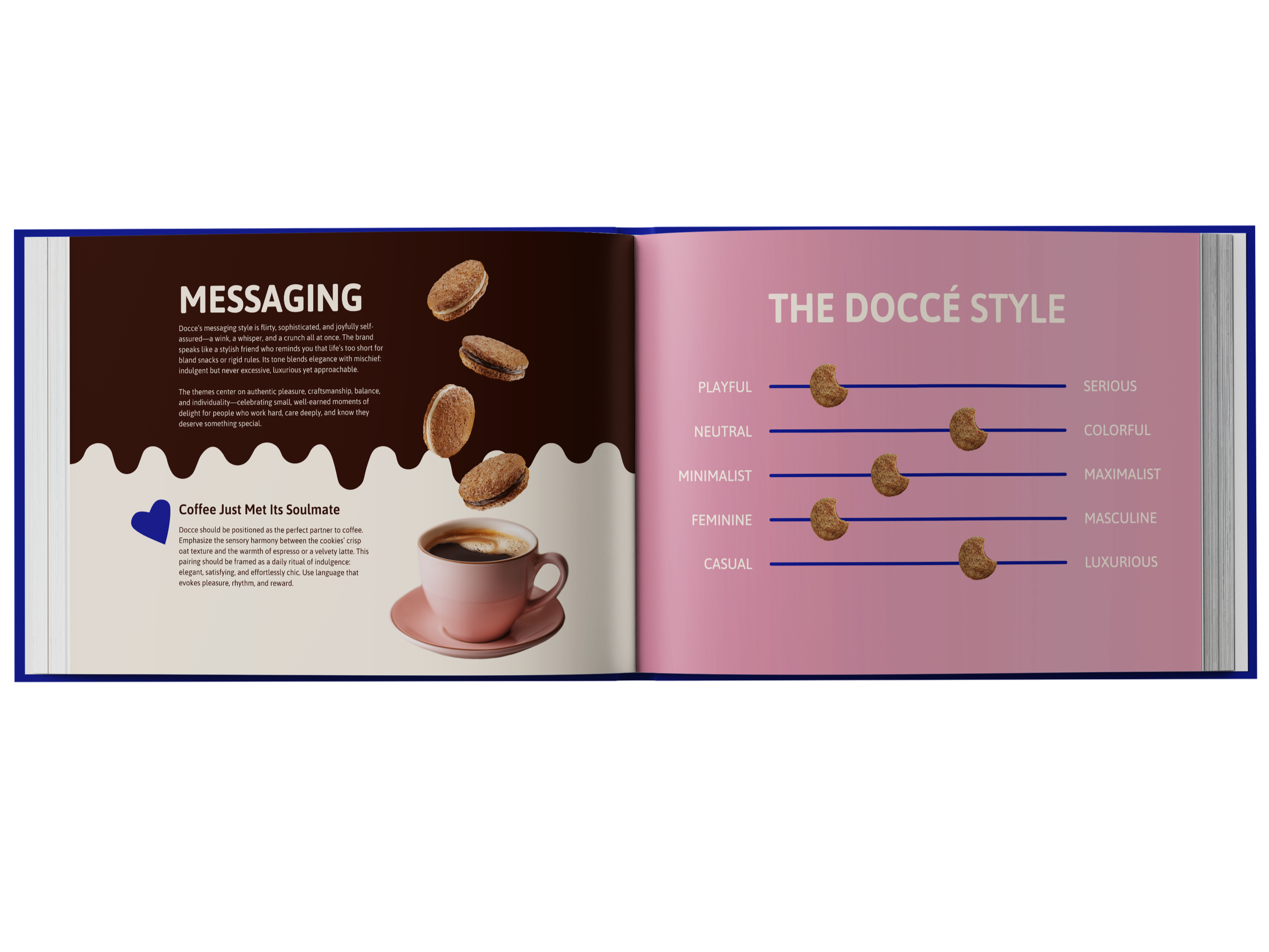
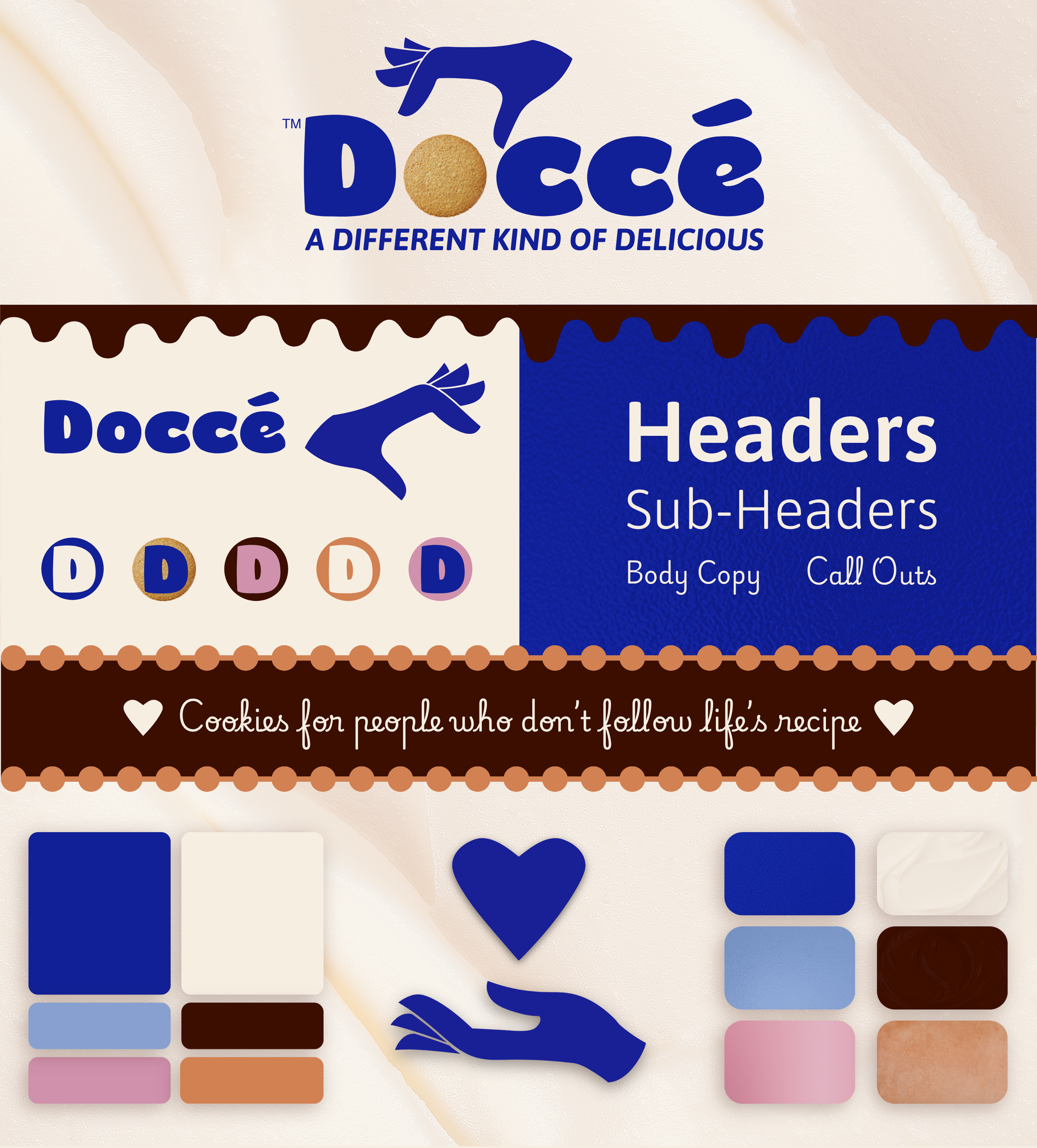
FINDING THE VOICE
The visual identity gave Doccé a recognizable, stand-out-on-shelves face. The unique voice gave it a soul.
We imagined the brand as a gracious hostess: warm, confident, glamorous yet approachable, and always encouraging people to enjoy themselves.
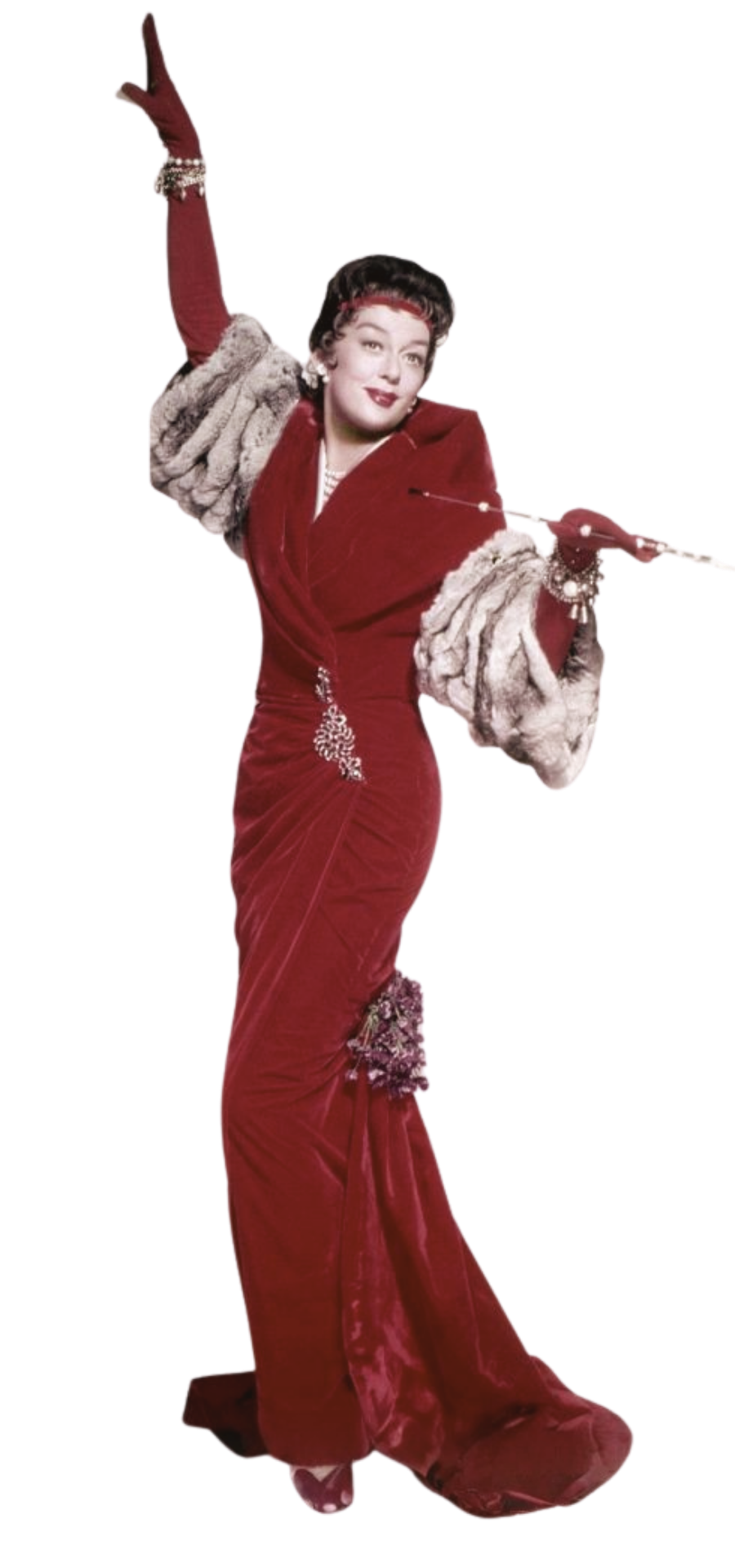
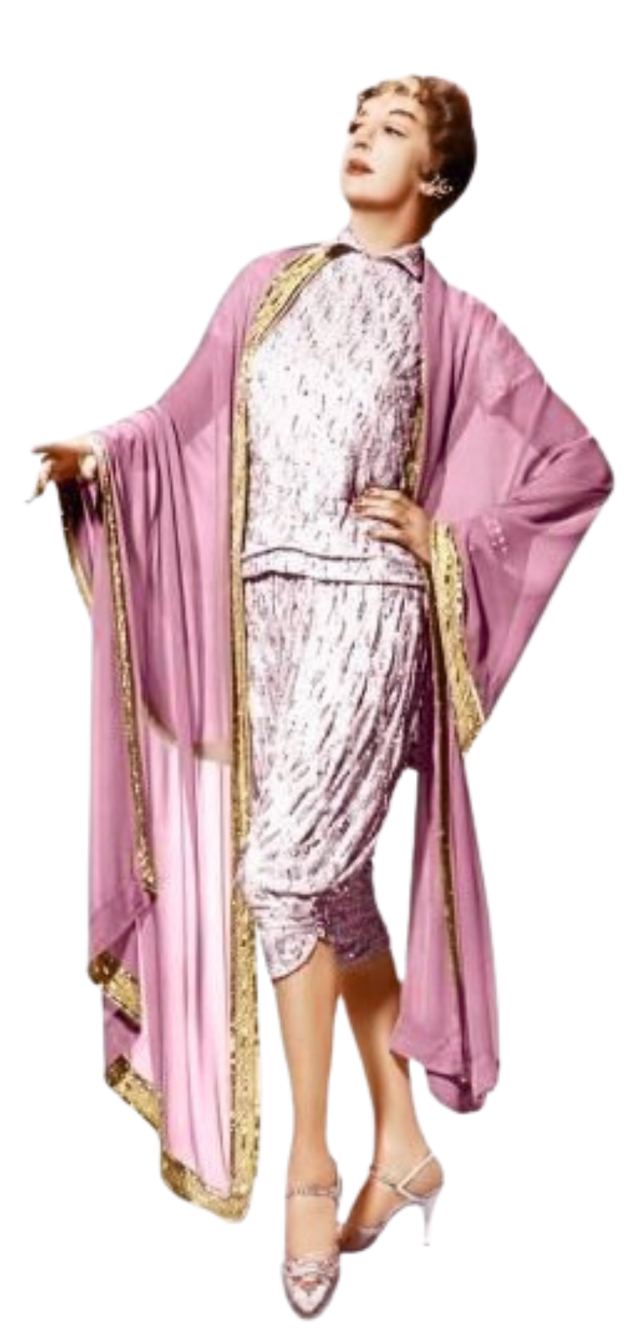
I was specifically inspired by the character of Auntie Mame (of the eponymous 1958 film), whose voice embraces pleasure without apology. Auntie Mame reminds us that life isn't meant to be lived entirely by the rules, and that some experiences are worth savoring simply because they bring joy. Ever the generous and charming hostess, she encourages us to partake of life’s banquet.
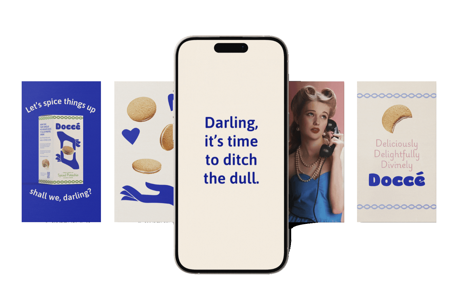
This perspective informed an extensive messaging library, including taglines, packaging copy, social content, and marketing language such as:
"You deserve something different. Something Doccé."
"Deliciously, devilishly divine. Of course it’s Doccé!"
"Cookies for people who don't follow life's recipe."
“Life shouldn’t be all kale, no cookies.”
More than just a tone of voice, it became a worldview that the brand could stand upon.
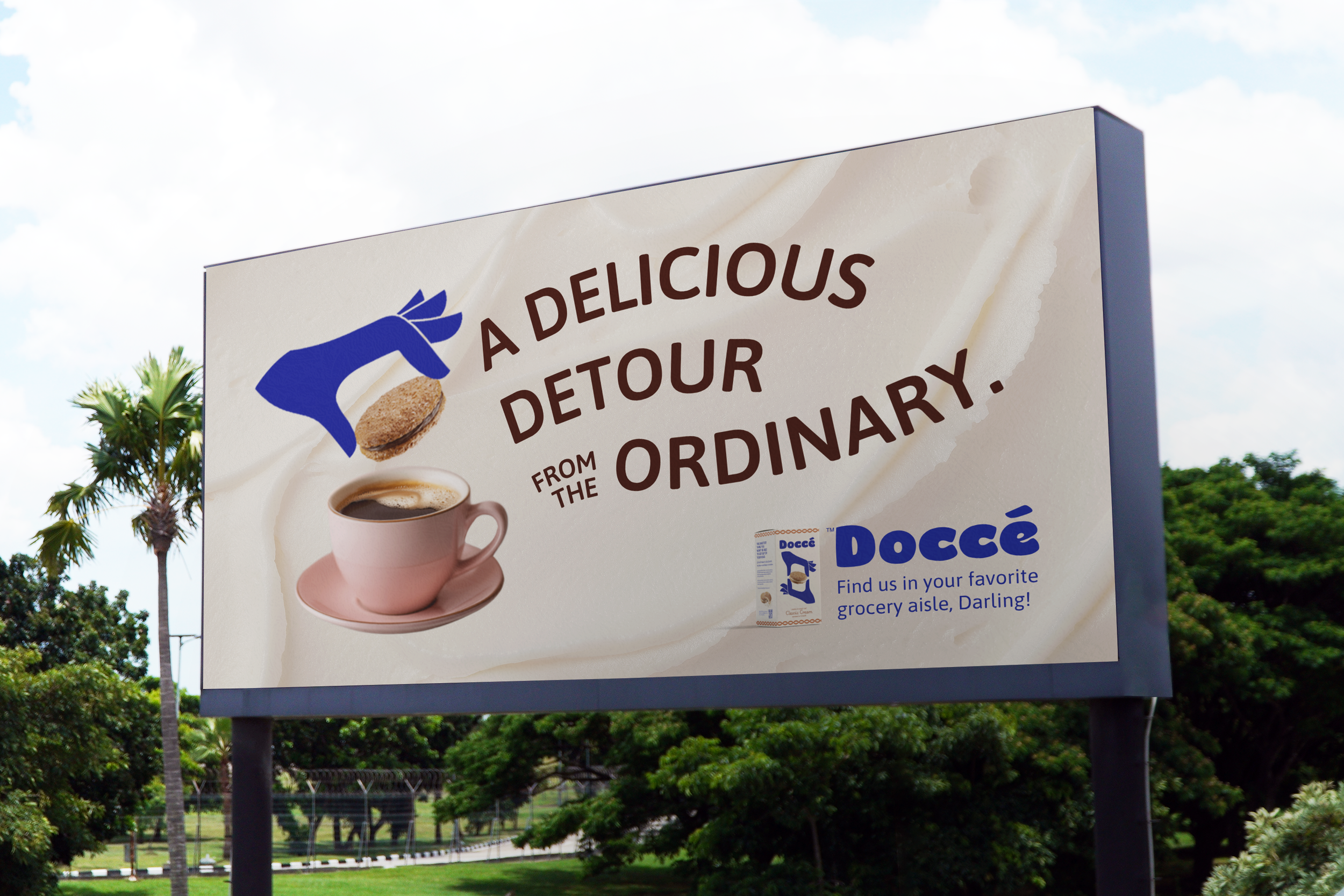
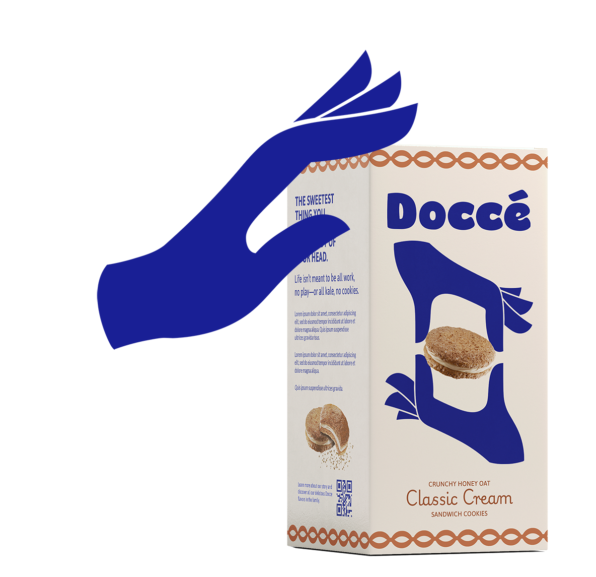
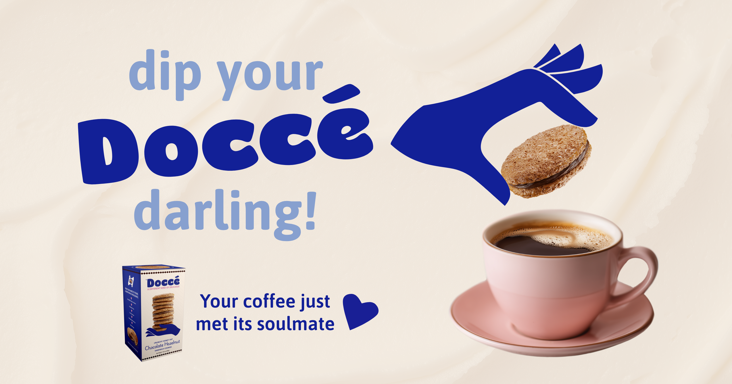
THE DOCCÉ HANDS
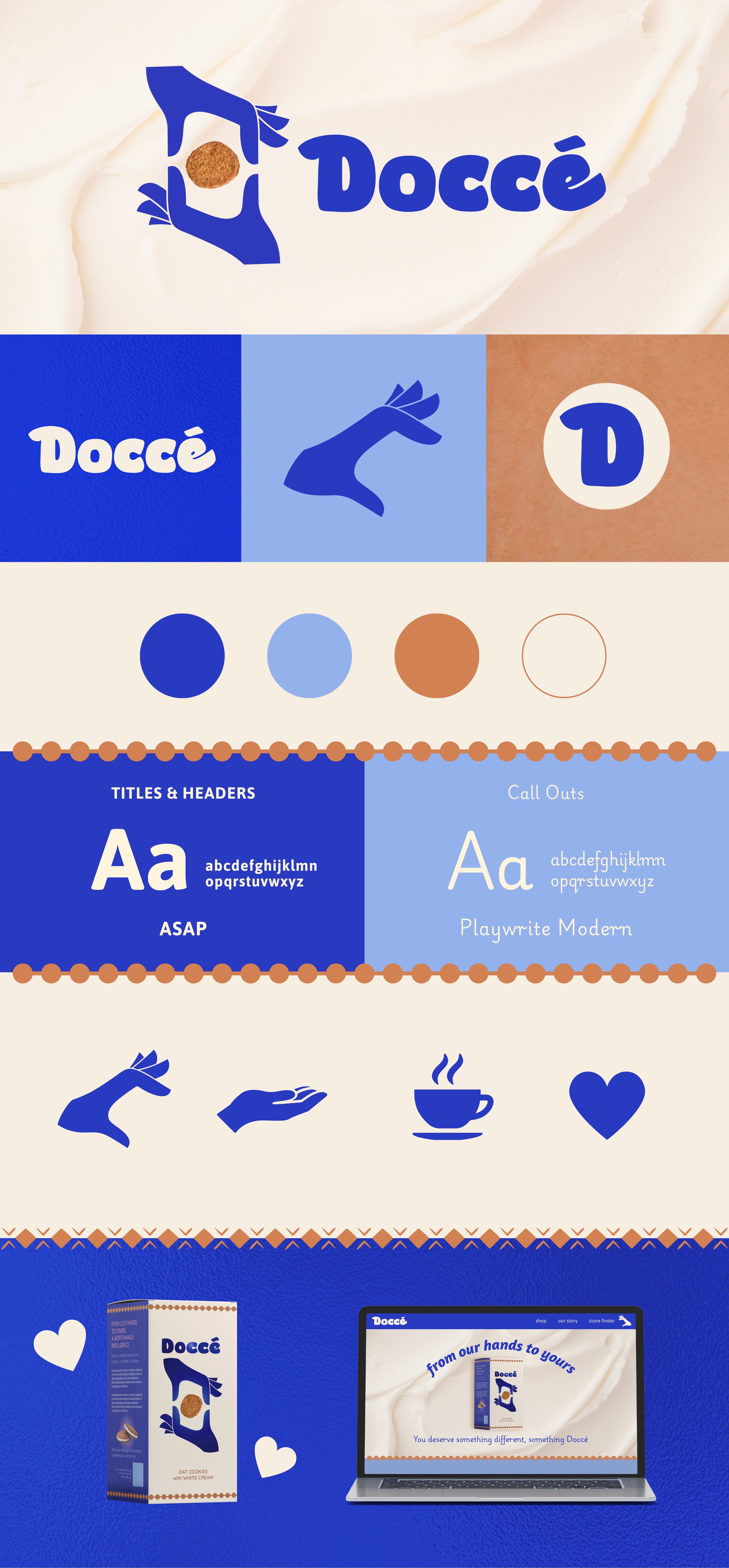
The final visual identity was built around a simple, expandable symbol: the hand.
Hands make. Hands give. Hands welcome people in. They carry the product, offer the plate, pour the coffee, pass the box across the table. For Doccé, they became a way to express both the handmade nature of the cookies and the spirit of hospitality behind the brand with wit, warmth, and instant recognizability.
I developed a custom illustration system using bold blue hands that could interact with product photography, packaging, type, and motion. This scalable system is intended to grow with the brand as the flavors and product line expand.
The result was playful and graphic, but also deeply functional—a visual language that could stretch across retail, digital, social, and sales environments without losing its character.


THE OUTCOME
Doccé entered the world with a brand system designed to help a new product earn attention, trust, and appetite in a crowded category.
The final identity positioned the cookies as neither a traditional indulgence brand nor a health-focused alternative, but something more interesting: a joyful interruption to the optimized life.
Since launch, the brand has generated interest from regional and national retailers, helping open conversations with major chains and specialty food distributors. With the final recipe now complete, Doccé is preparing for retail expansion.
Look for Doccé on shelves soon, darling!