Seppi Craft Sparkling Wine
WINE & BEV | RE-BRAND
SCOPE
Brand Strategy
Identity Design
Creative Direction
MY ROLE
Led end-to-end brand strategy and creative direction; directed a lean design team and developed core creative concepts and copy.

ECLECTIC
|
NOSTALGIC
|
LUXURIOUS
|
ECLECTIC | NOSTALGIC | LUXURIOUS |
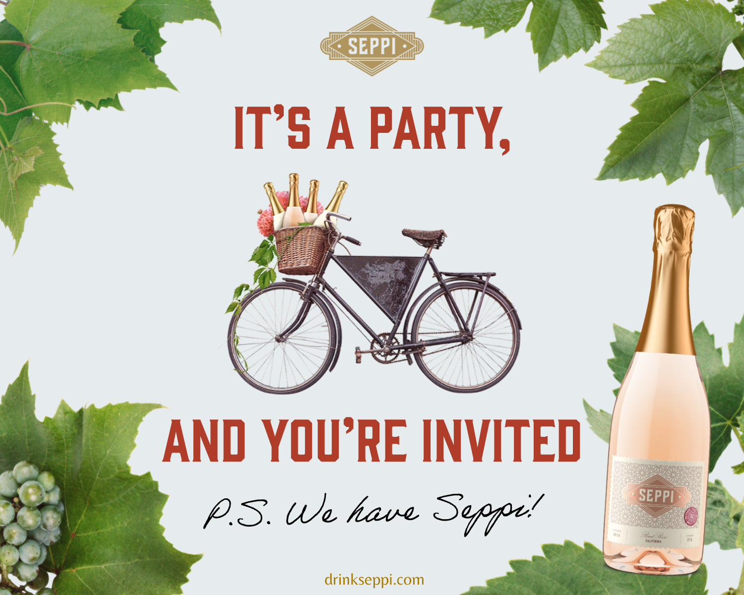
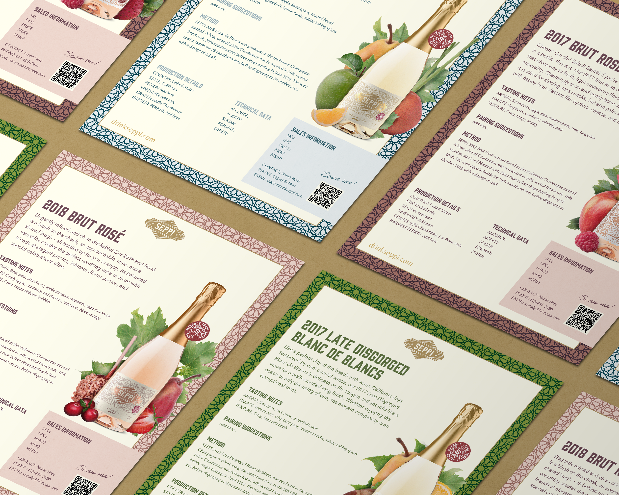
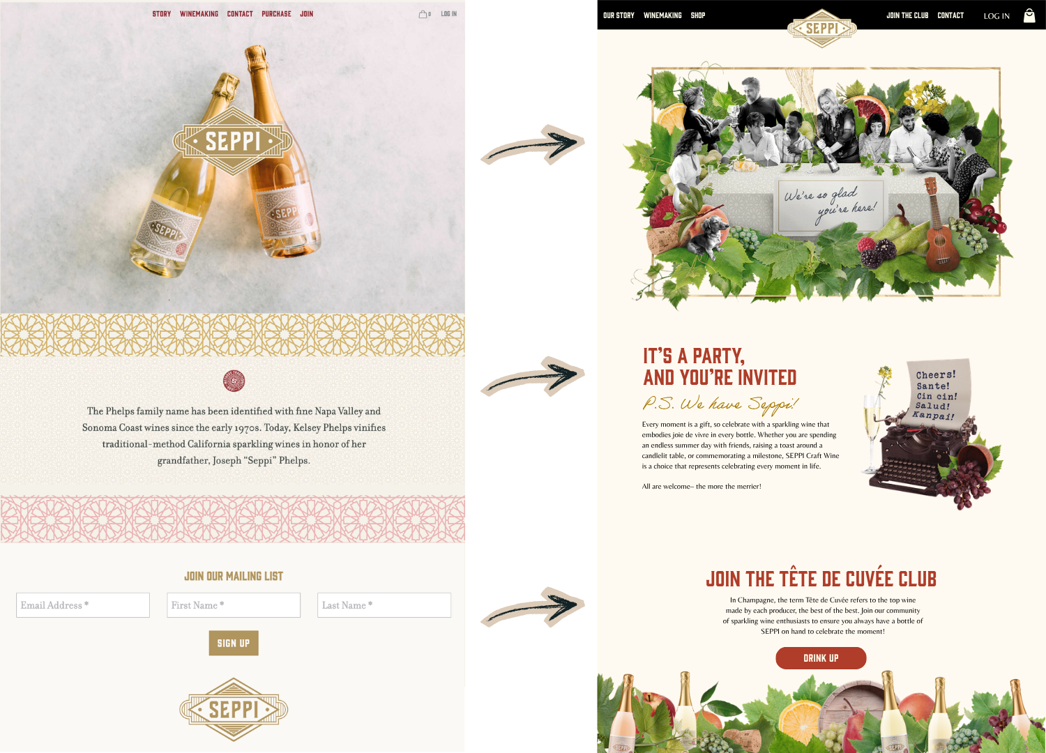
The original brand lacked distinction in a saturated Central Coast wine market. Despite a premium price point, the identity relied on familiar cues—pink and gold foil—without a clear story or emotional connection.
Kelsey Phelps, founder and granddaughter of famed vintner Joseph Phelps, wanted to keep her classic logo, florette patterns, and some fonts, but see it expressed in a much more evocative way.
The result was a brand rooted in inclusivity, nostalgia, and liveliness—one that could invite more people into the experience of sparkling wine while still honoring its quality and historical legacy.
SEPPI came to us for a rebrand—ready to move beyond a generic visual identity and build something with meaning, personality, and staying power.
STRATEGIC FOUNDATION
We began with a strategic Brand Map, redefining the brand’s positioning, audience, and voice.
At its core, SEPPI became about shared moments—celebration without pretense. A brand that holds both elevated product and an open invitation.
With future vintages planned, it was important that the design system created was intuitively scalable while maintaining consistent visuals.

CONCEPT DEVELOPMENT
From this foundation, I developed three distinct identity directions, each exploring a different expression of the brand’s personality.
Through close collaboration with the client, we selected and refined a final direction—centering on the idea of the party: the fleeting, meaningful moments that happen between people, and the objects, textures, and memories that surround them.
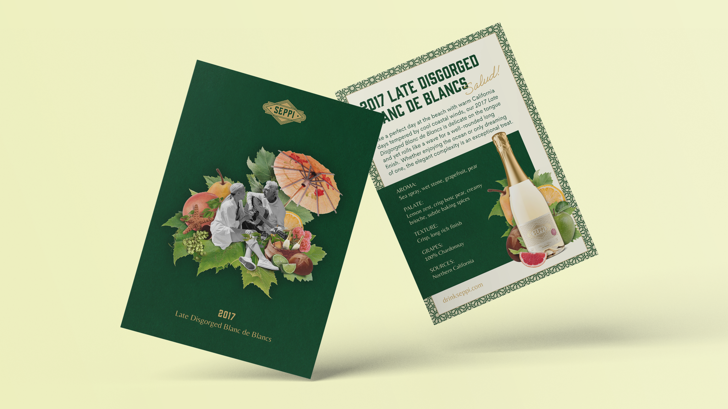
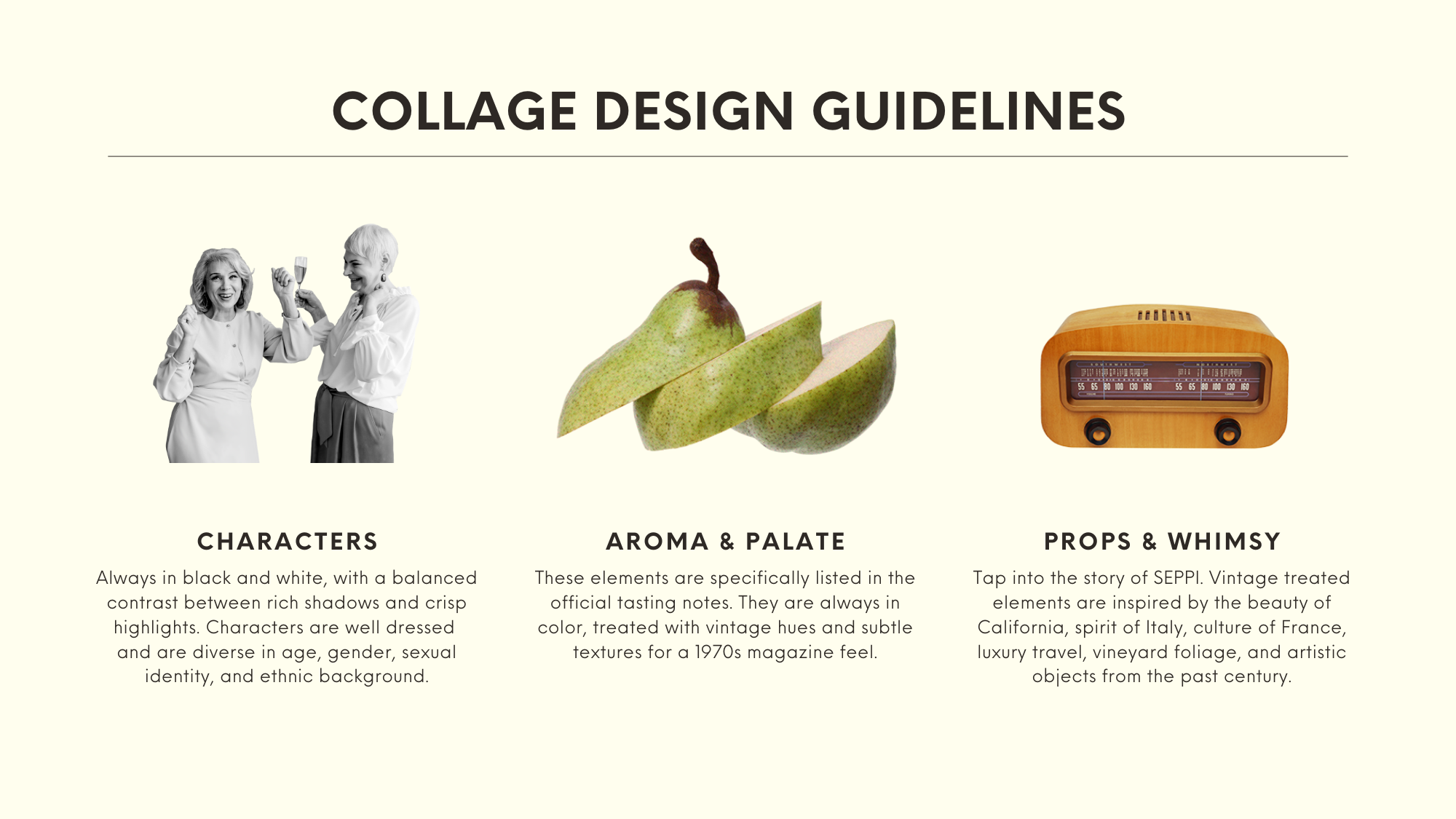
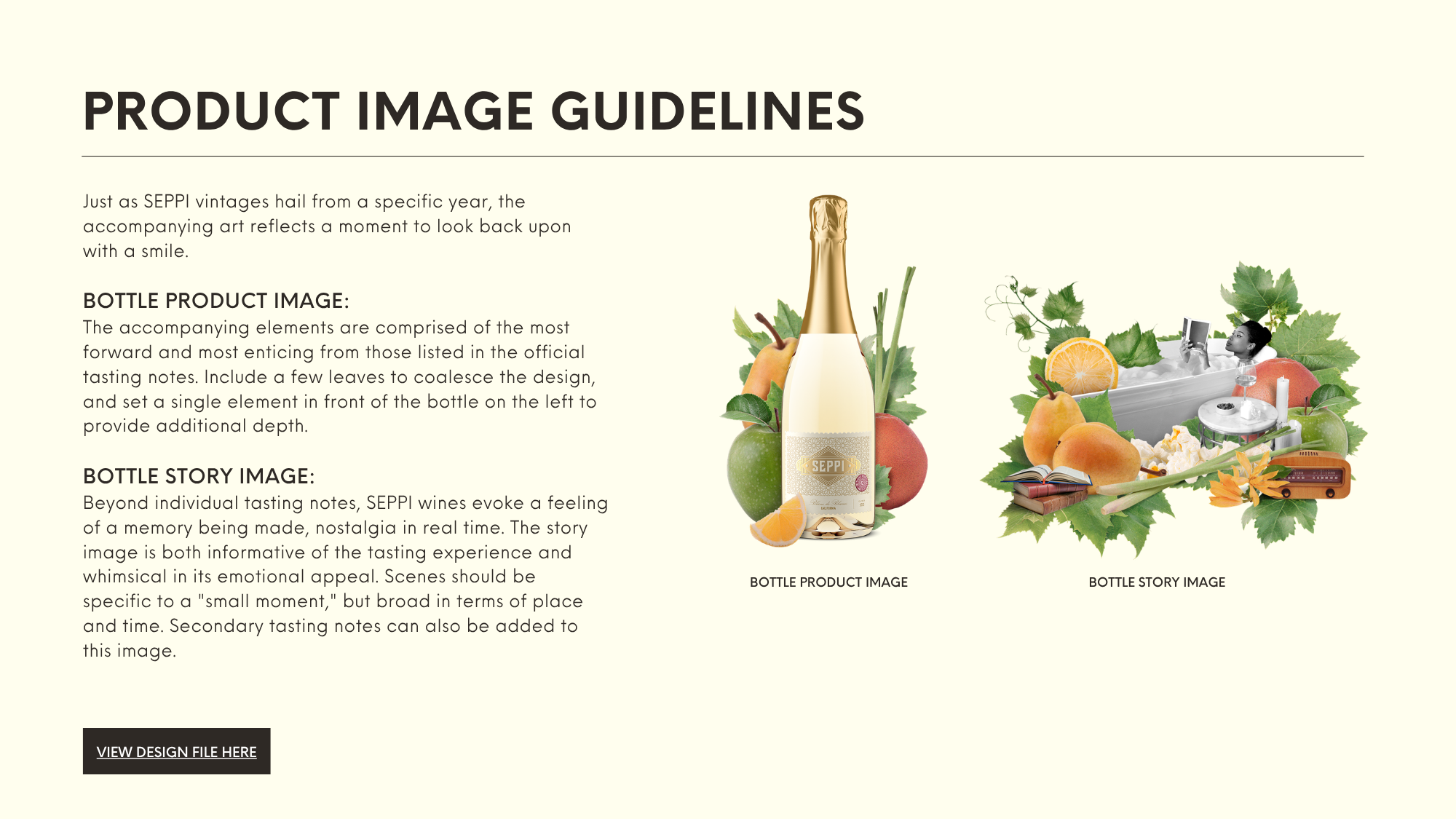
The final identity was built as a modular collage system—layered, expressive, and deeply personal.
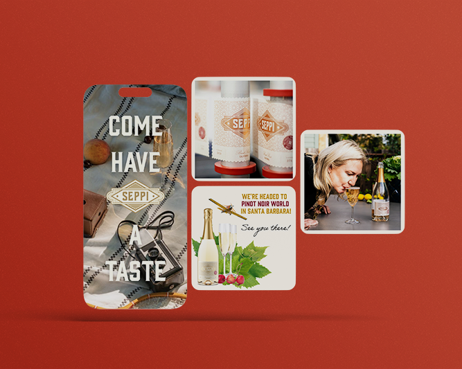
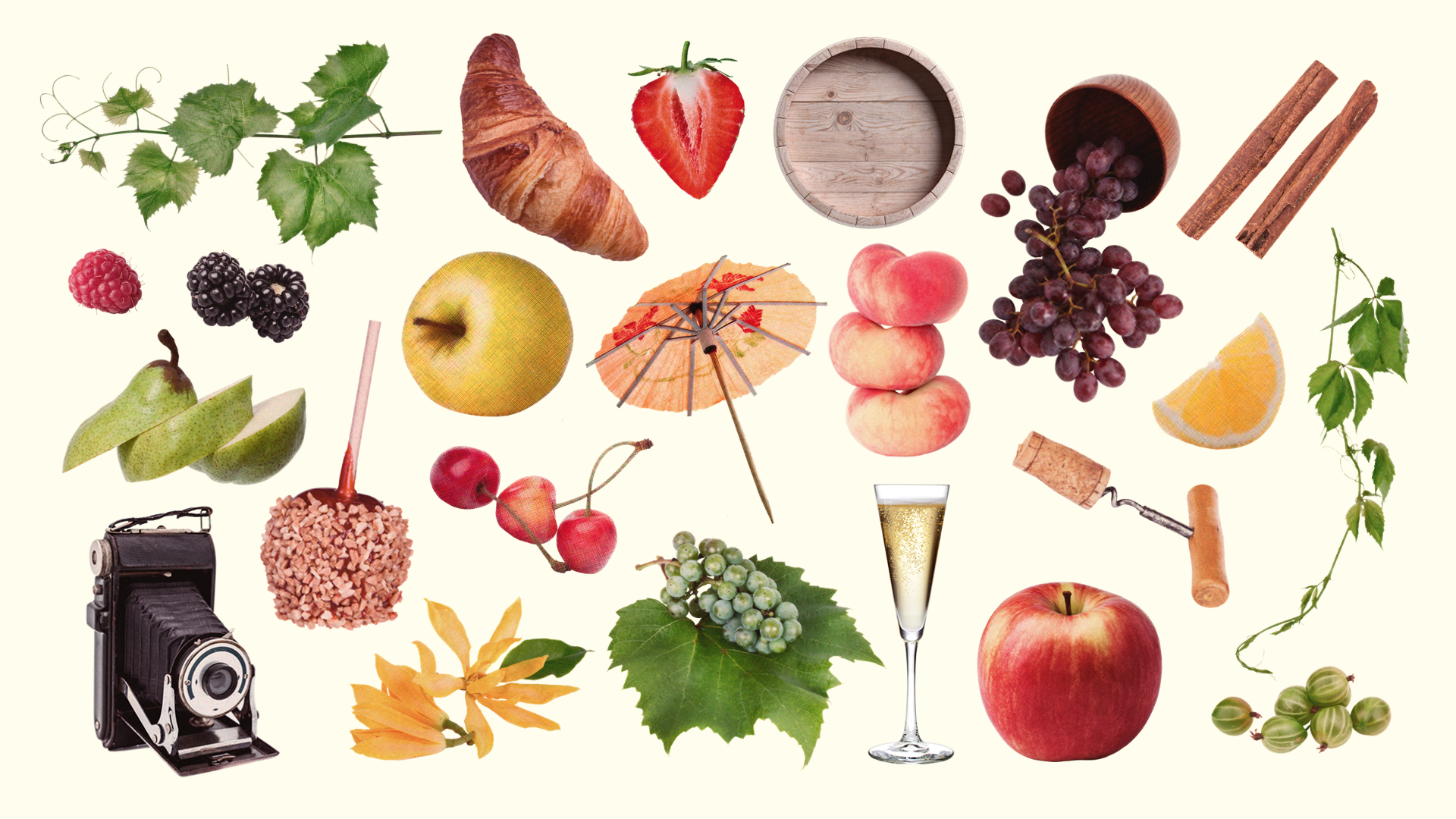
Drawing from nostalgic and California wine country references, the visual language included assets drawn from the wine’s aroma & palate, as well as whimsical supplementals like bees, flowers, corks, vintage airplanes, record players. Each element contributes to a sense of place, memory, and celebration.
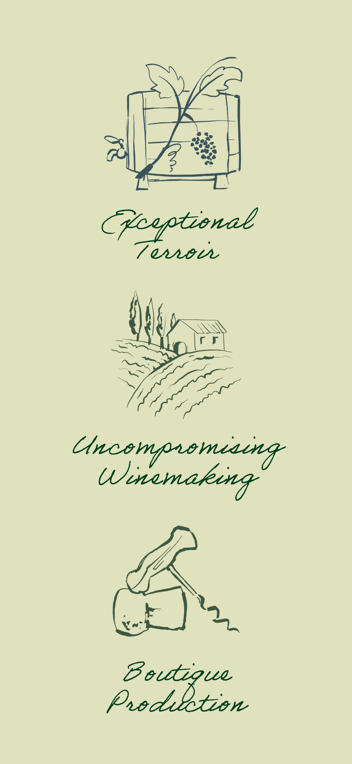
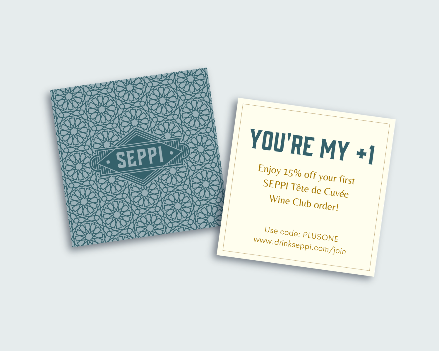
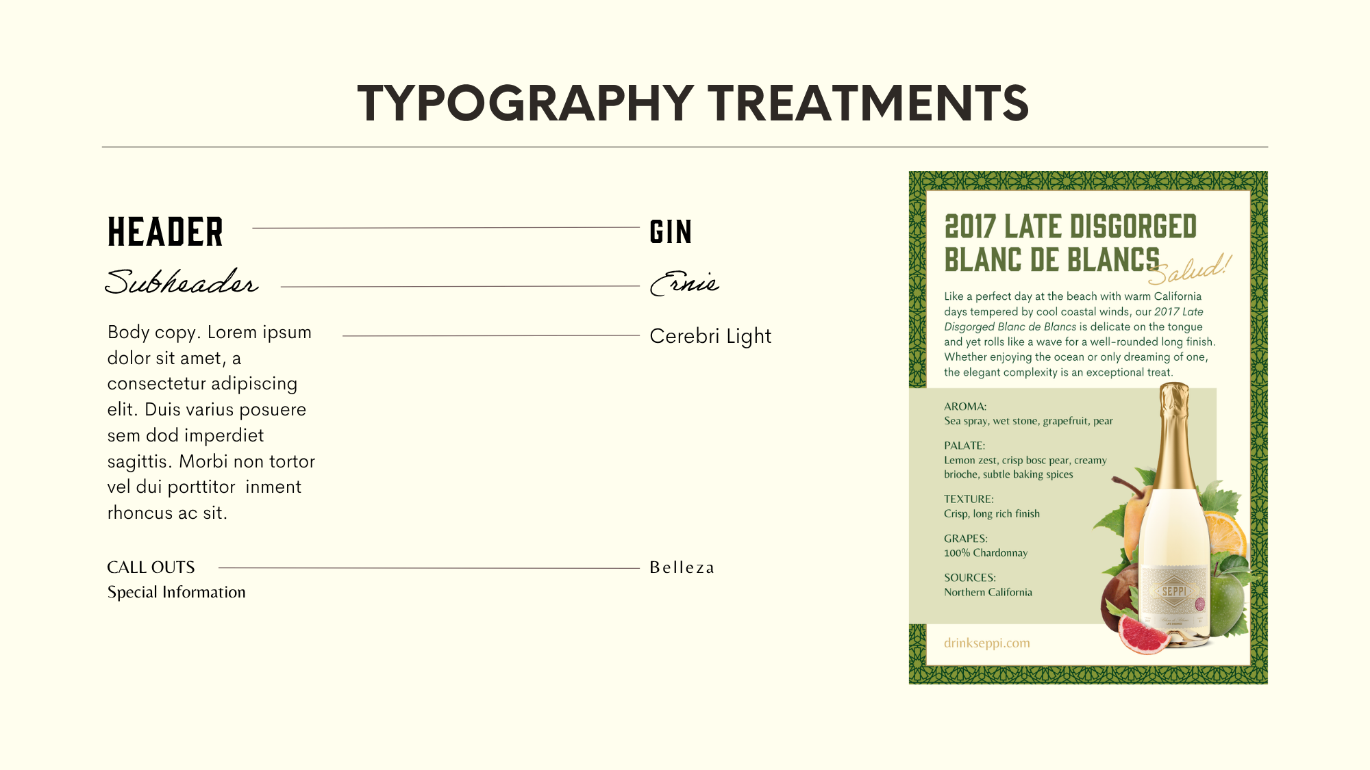
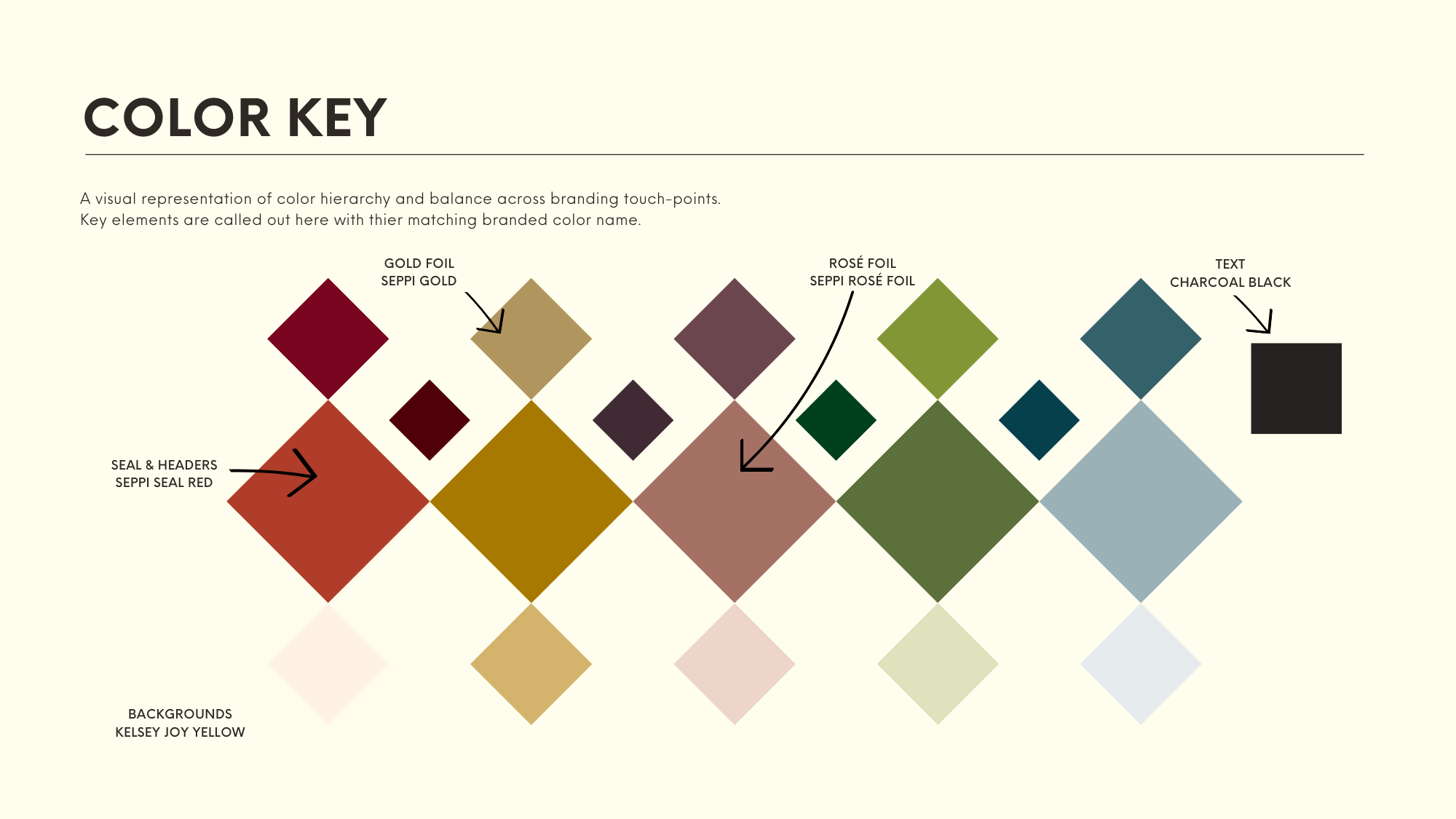
The brand identity system included an additional logo lockup, expanded color palette, typography updates, custom icons, textures, a flexible library of visual assets, marketing copy, and clear guidelines—designed to scale across touchpoints while maintaining a cohesive, recognizable identity.
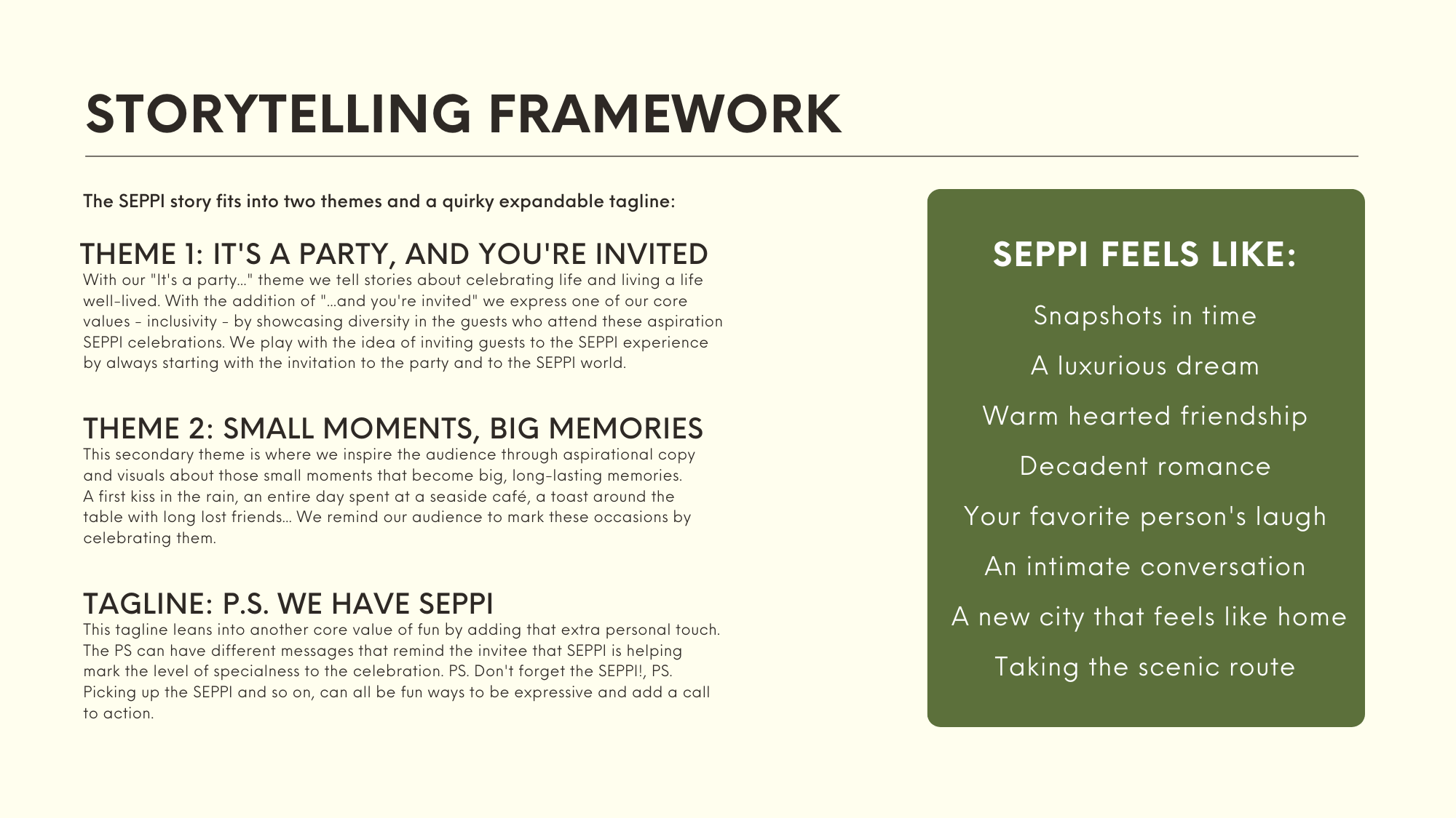
Alongside the visual system, I developed the foundational messaging and story frameworks to reinforce the tone:
“It’s a party, and you’re invited.”
“Small moments, big memories.”

A LIVING COLLAGE SYSTEM
At the heart of the identity is a modular collage system designed for longevity and creative flexibility.
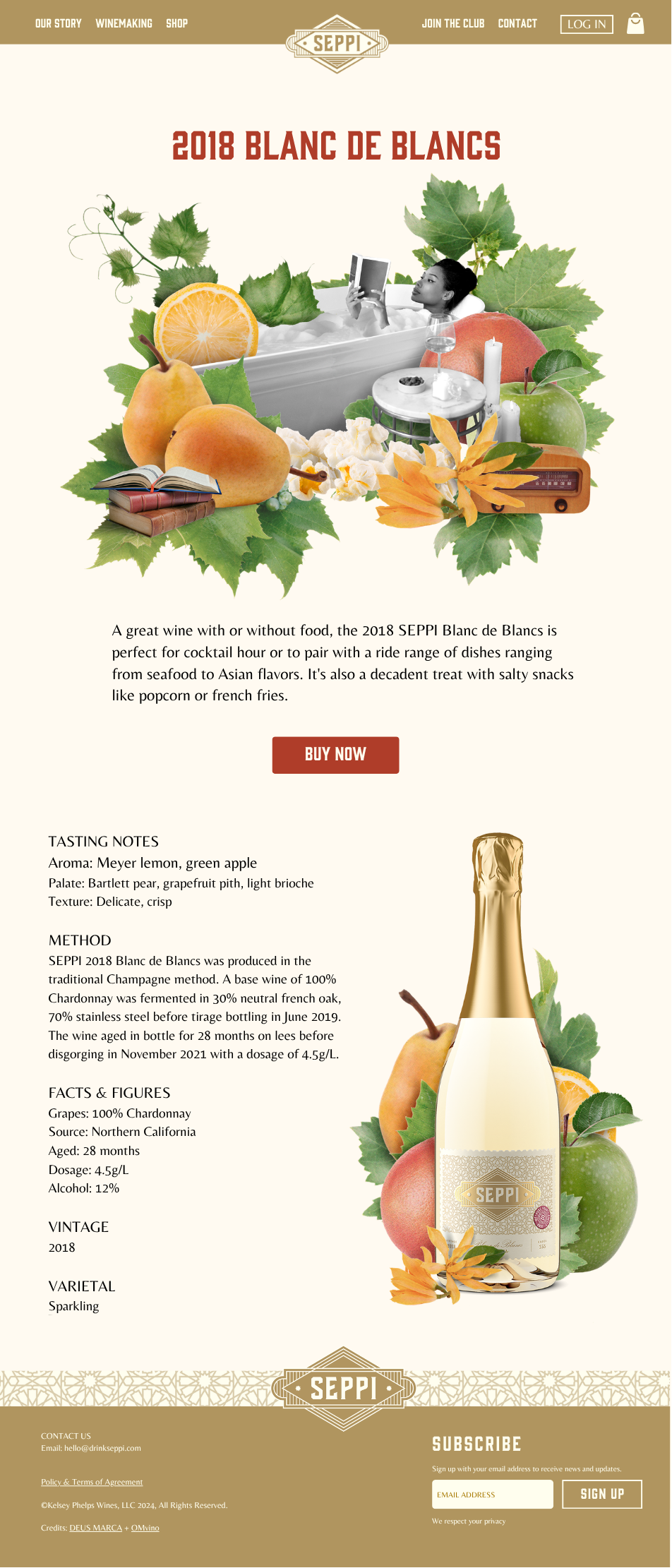
We built an extensive library of individual visual assets with ingredients tied to specific vintages and broader lifestyle and environmental elements. A wine expert was brought in to ensure tasting notes and terminology were accurate and aligned with industry standards, grounding the expressive visuals in real product knowledge.

Each vintage has two collages associated with it: a product image and a lifestyle image depicting people from all walks of life. Marketing compositions pull from the entire library, allowing for an endless combination of on-brand visuals.
This approach turns the identity into an evolving system rather than a fixed set of rules, making it easy to create new materials while preserving a consistent visual and emotional language.

BRAND EXPANSION
The identity extended across key brand experiences:
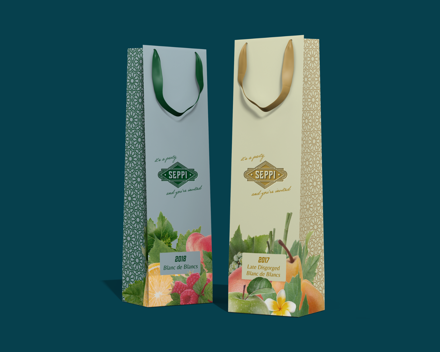
Product Design System
Website
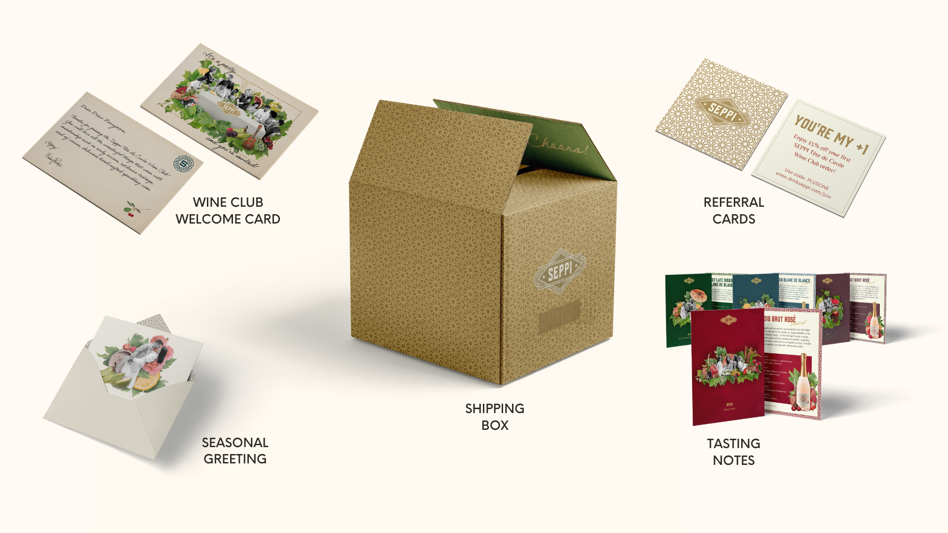
Unboxing Design
Sales Materials
Social Media Guidelines
Wine Club Storytelling
Partnership Activation Concepts
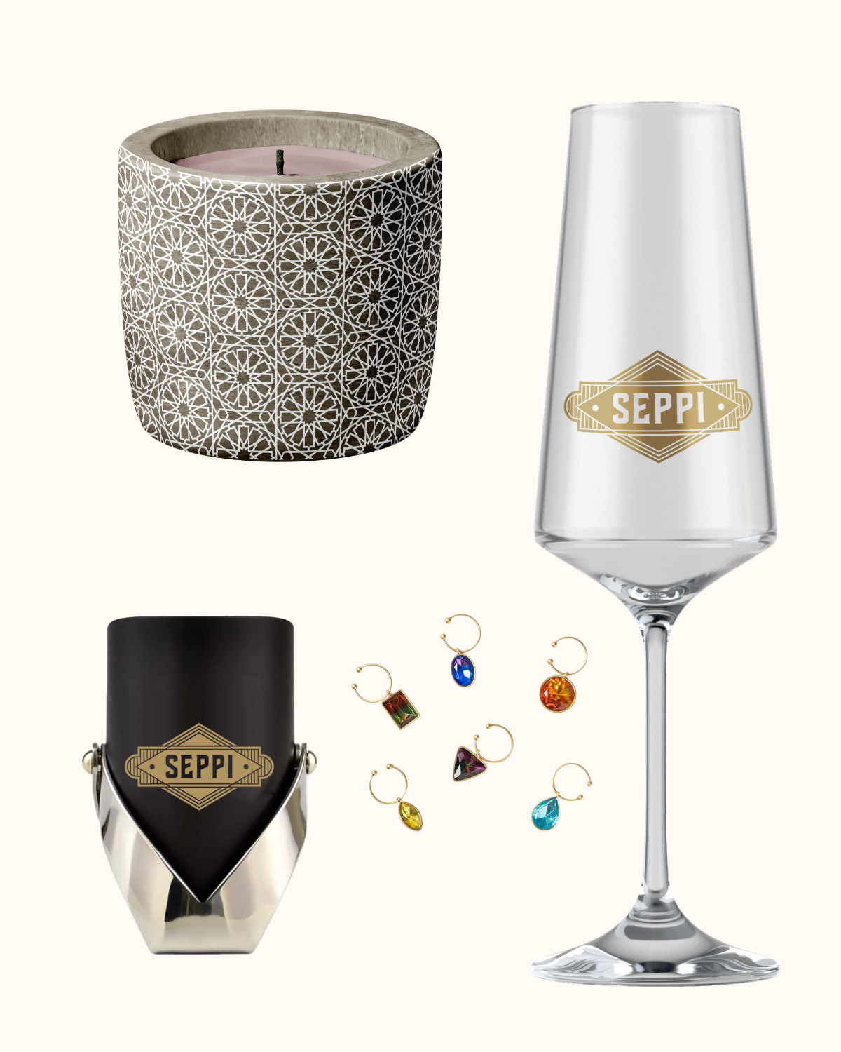
Lifestyle Product Concepts
Each touchpoint was designed to feel intentional, immersive, and aligned with the brand’s core narrative of luxurious inclusivity.
Beyond aesthetics, the overall brand strategy was built for longevity and adaptability—creating a flexible foundation that could support future campaigns, partnerships, product releases, and evolving customer experiences while remaining cohesive and authentic to SEPPI’s vision and values.
OUTCOME

The rebrand positioned Seppi with a distinct and memorable identity—balancing a premium product with a sense of openness, warmth, and celebration.
The result is a brand that feels both elevated and inviting, supported by a flexible system designed to evolve alongside the company over time.
Since the relaunch, Seppi has expanded distribution, received multiple industry awards, and gained broader recognition within the wine space.